(115.56 KB, 984x874)
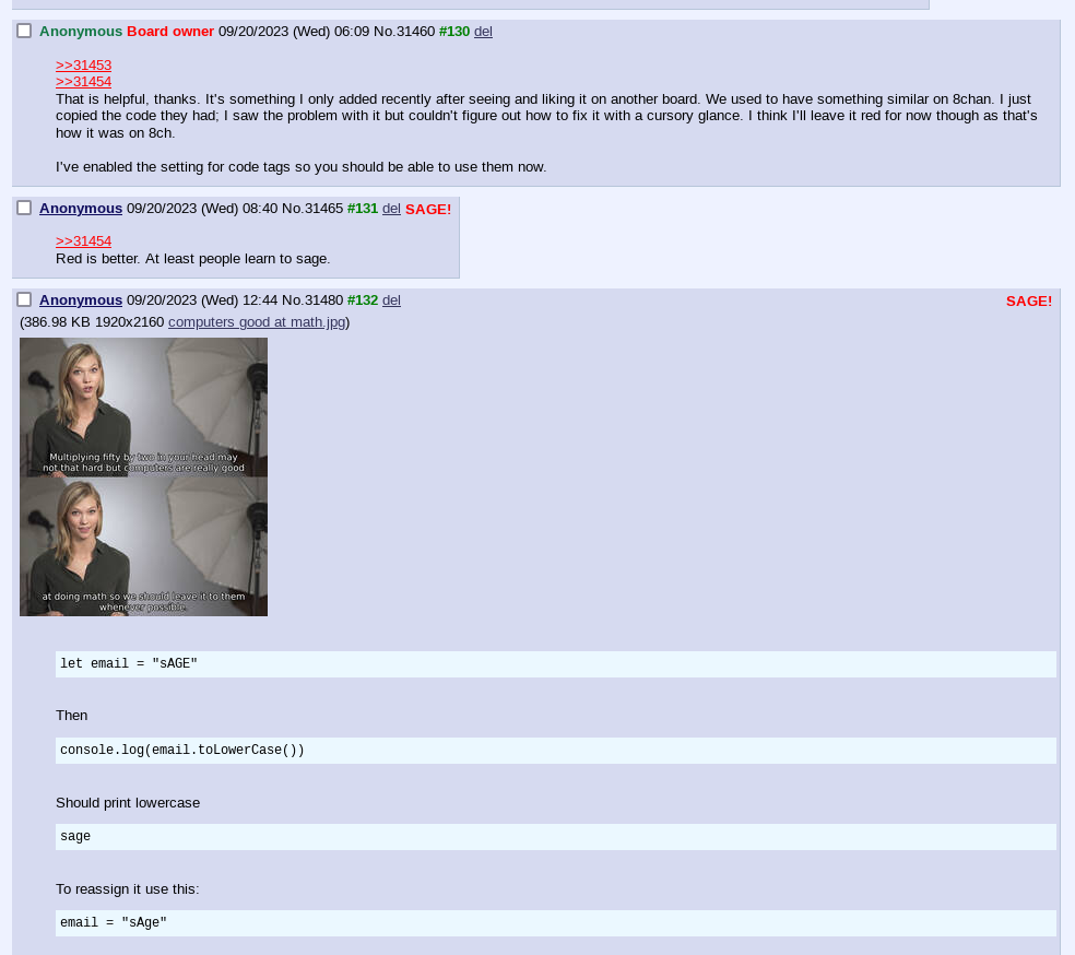
 >>/31705/
 >>/31706/
16k sounds much, but pattern matching isn't something a modern computer/browser wouldn't do in a fraction of a second while loading the page. There are much more sinister ways to rape CPU with CSS. Actually, I looked some stuff up and improved the rule:
.linkName:not(.noEmailName)[href="mailto:sage" i]:after {
  content: "SAGE!";
  float: right;
  color: red;
  padding: 4px;
}
:not(.noEmailName) excludes all emailless posts, and i makes sure "mailto:____" is compared case-insensitively to "mailto:sage" (I do not know and care not how xD). Certainly looks cleaner than the whole list I typed by hand generated before.

 >>/31700/
I skimmed through archives and can't say there's anything worthwhile. Default vichan/infinity skin and cyan bg gray posts one. But that SAGE thing was neat wherever you picked it from. It's not that Lynx is bad technically, it mostly has an identical markup in html, it's just dev/admin is lazy to make it better looking default style, so you judge them based on this.

While I'm at it, should we make code blocks a tit more readable with this rule:
/*Style code segments*/
pre {
  font-size: initial;
  display: block;
  background: #ebf8ff;
  padding: 0.4em;
}

Hide pointless action links (from my point of view)
/*Hide [Preview] link in post header*/
.linkPreview {
    display: none;
}
/*Hide [Last 50 Posts] link*/
.linkLast50 {
  display: none;
}

Now here's something more fun. It displays post numbers within the thread to keep track of bump limits. I haven't been able to toggle it only for threads, so it displays nonsensical numbering on front page (not in catalog).
/*Count and display post number within a thread*/
.opCell {
  counter-reset: postnum;
}
.linkQuote:after {
  color: green;
  font-weight: bold;
  counter-increment: postnum 1;
  content: " #" counter(postnum);
}
Maybe it'd make more sense to display this number on the left, instead of default "Anonymous" screen name.

And finally a rule just to make fonts more readable:
body {
  font-size:  larger;
}

I'm practicing little by little, so maybe I'll shoot more of this stuff later. It feels therapeutic in a way, to learn these stuff, more therapeutic than I'd expected looking at pics of cute girls would be, which actually turned out very depressing ;_;