wide thumbs png
(438.13 KB, 1367x525)
fixed thumbs png
(444.15 KB, 1367x353)
>>/40234/ New counter is hideous indeed. Original was sharp looking, but itched my autism. I wanted to place it after checkboxes originally, to keep them aligned. However it is impossible in CSS. What possible instead is to float checkbox to the right and counter to the left, but then checkbox finding task becomes pixelhunting, and relation to it's function (mark post for report or deletion) loses original meaning. It definitely has higher priority than the counter.
BO, see all possible options inside attached text file. Perhaps you should revert it back to original keeping the -1 or choose third option. Keep SAGE as it is.
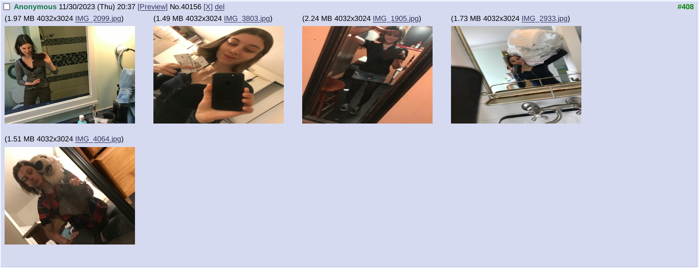
Another urgent issue
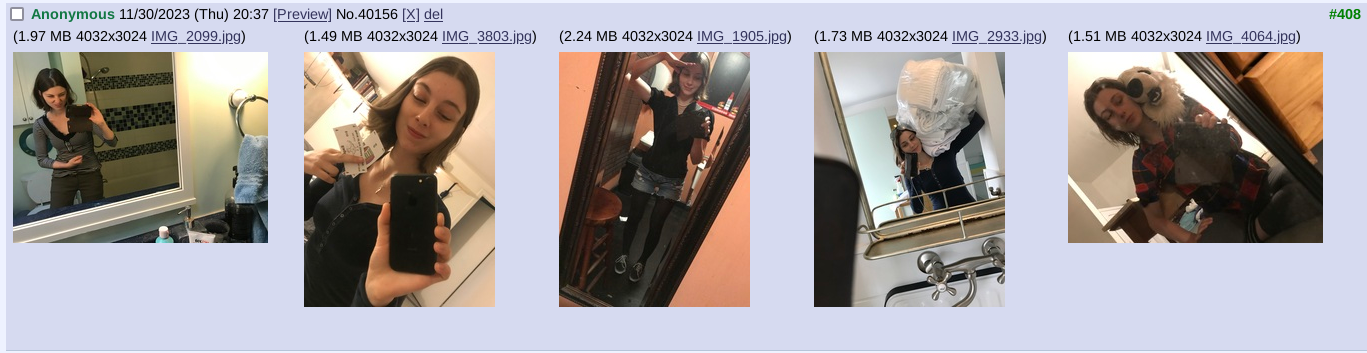
Squished looking thumbnails. For whatever reason EXIF rotation data is ignored in page layout, here is solution:
/*Fix squished thumbnails*/
.uploadCell img {
height: auto;
width: auto;
}
Of all alternative styles available from menus at the bottom of page I fancy Trebuchet theme with Dark Orange color palette. Perhaps we can adapt it to our board. It has some issues like non-expanding images and few off colors.
Additionally there's https://magrathea.endchan.net/ front-end, with completely different HTML and better default styles (not entirely portable unfortunately), check out yourself.