steel table png
(62.3 KB, 1521x587)
rations png
(14.33 KB, 297x309)
The steel table in >>/33906/ is hard to crack, it is not clear which elements add up and which are subsets of others. The numbers don't match well. See for yourself.
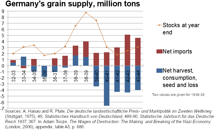
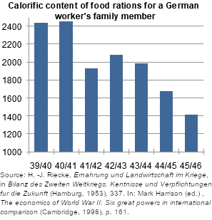
The grain supply >>/28714/ has some discrepancies but rounding is enough of an explanation. I've found rather than putting a large column with harvests going up and another with consumption going down tracking net harvests/consumption exposes the more interesting topic of stocks and imports. I can clearly see what's narrated: early on there are bumper harvests followed by harsh years in the mid-30s, and though harvests are better later in the decade imports are made to boost stocks. During the war stocks are rapidly consumed so requisitioning from occupied territories makes up for it. This also shows in ration data, there was a drop in the early-mid war which led to worries but increased requisitioning made up for it at first. Then it still went down and after the war ended there was still a harsh food crisis at hand.