Actions
(589.22 KB, 2800x2700)
(1.69 MB, 2800x2700)
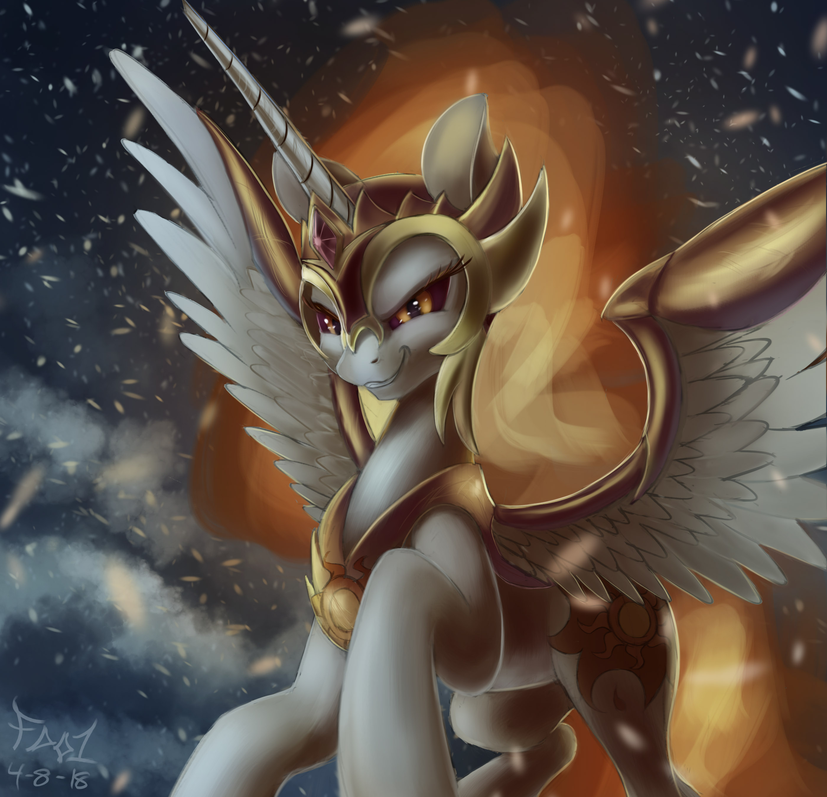
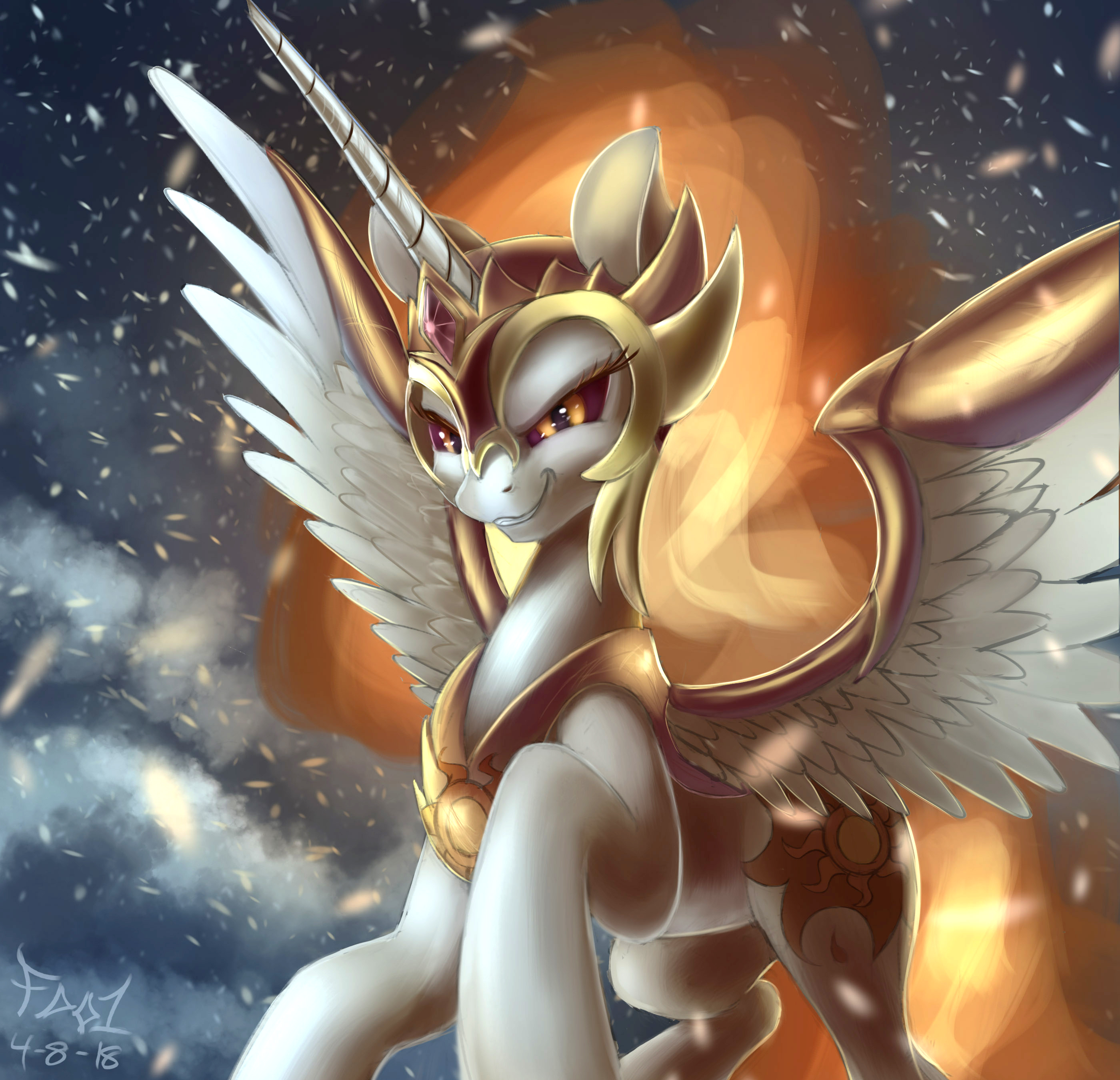
 >>/1620/
> That actually is wise as though it may not be fancy, you get to know the limits of the tools available.
yeah, it´s pretty much enough for me even though I could be doing cooler things than this

> I´d recommend if you wanted too you could go ahead and download gimp because it's free if you wanted to just mess around with filters that I use
yeah, I am writing this down and I may check it if I get too tired of the basics.

> While it does take awhile to get used too amist all the mix of tools (some outdated design schemes, some inferior attempts at photoshope tools and some stuff that actually is pretty cool) using and messing with the filters is easy enough.
yeah I am imagining that. Again, it´s whenever I get tired of it and if I ever need something to refresh the gallery....and you are there to make a counterpoint. I would suggest that you use that one and I use mine so we don´t collide or overlap in ideas.

> as those are the only ones I put any thought into rather than just running through a filter on default settings like normal.

I thought 04 would have taken you less effort because I see it as any other filter. Does it require something special or a treatment with care for it?

> I really like 04's as the cubism filter when I shrank the squares enough to make a pony vaguely discernible it gave this haunting glass window vibe that I really liked, though 05 is probably the most versatile as I can think of several uses for a red blazing Luna picture
yeah 05 is really sick, I am probably sure that the artist sees this and would be amazed of such a combination of colors. 04 fits for something distant, with a background mindset instead of showing it right into the eye.

> Emboss I just use on everything and see what it does. While perhaps a little boring do to how often I mess with it I do agree that it can provide some interesting opportunities.
Yeah, it´s like your standard monochrome effect for this program it seems.

> my fav is  >>/1600/. Though  >>/1559/ is the better picture, the edit on 1600 lifts a somewhat meh image into good territory. The shading looks more defined and it really helps Flurry stand out against the background and makes the body look actually well constructed, rather than just above basic almost flawed. The zooming and deemphasis of the background make the poor design look more like an out of focus camera effect. It's at least an order of magnitude better.

I am really thinking of uploading it,because it just improves a lot of things that puts Flurry into the main spot.
I have seen praise of some edits like this one:
https://derpibooru.org/1702834?q=edit&sd=desc&sf=score

and I am seriously thinking if making Derpi to notice these ideas and give a new breath to some unused pictures.  Not that we are heroes but I definitely do them quickly and pretty much with pleasure for the eyes and for future fics.

I think I will notify them for this edit. Check how the reactions for Daybreaker were. 1st one is the original and the 2nd one is the edited. But I haven´t made anything, I have just checked the edit tag and what we are doing fits correctly for what some people like.