Actions

(1.69 MB, 1920x1080)
(1.48 MB, 1920x1080)
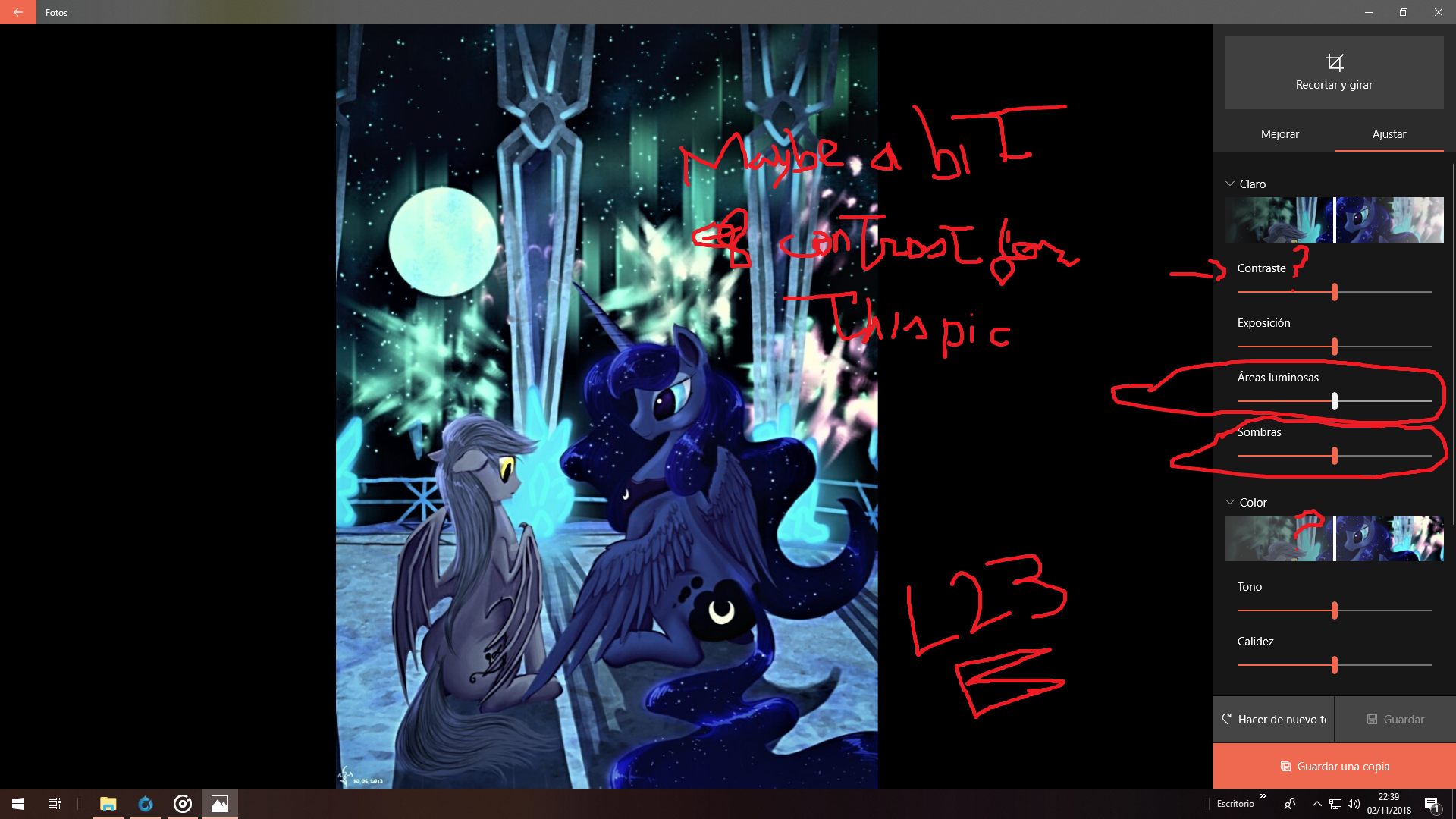
 >>/2397/
so do you want me to explain what I have made here  >>/2391/?

Photo Editor Pro (mobile part):
Basically there is no visual default effect (black and white, chromatic...) that appears in the app so it pretty much comes from the adjustments. The biggest changes are the slight discolor because Luna had a mane too saturated of blue for my taste so that implied making the OC bat a bit more grayish and adjust the brightness a little bit. Not sure how much I have modified the contrast or the exposition but there is a little spot of warmth (between 4 to 10 points of warm effect out of 100). The hue is important because it adds the slight green that appears on the edit.
About the attenuation....I don´t remember doing anything with it. If I did, I can´t remember because I do all of this in matter of minutes and even seconds.

PC editor from Windows 10 part:
the easiest part because I had most of the effort made with my own mobile so...what does the PC add?

I am posting two screencaps with the Windows 10 editor and point out the most important aspects to modify and add the cherry on top of the top of the cake.

Capture on the left: so there is a bunch of default effects but none of them are needed and I am not a big fan of them yet. If you hit the button I am pointing out, you will make the picture more detailed. I only recommend using it once because then it will become too defined and pixelated. You can adjust it whenever you have hit it and by default, it appears with the 50 percent of definition. This makes the picture a little bit sharper and it affected mostly for the contours of the wings. If you pick the mobile picture  >>/2402/
 and apply it, you will notice instantly how much it changes.

Capture on the right: the two adjustments I have used the most here, are the luminous areas and the shadows so the lightning becomes sharper as well and it gives a vibe of being more defined and less unfocused. The original pic gives a little bit of a turn off because it looks unfocused and lost with Luna´s mane.

The biggest aspects I have been focusing on here are the two shadows and how Luna´s body looks.
I ask myself if I have reused the discolor or the contrast this time on PC so I put two question marks if I have actually made slight changes to them.

It´s actually very complicated to describe it properly so I just show you the tools and the most important aspects brought for this edit. Again, it all happens in a very short span of time and for getting into the edit, I may have been through all the -100 to +100 values to check which one fits and I cannot recall if I have added an adjustment with little values here and there.

But it´s not even close to the hardest edit I have ever made.  >>/2354/, >>/1847/,  >>/1834/,  >>/182/ and  >>/1696/ are probably the hardest ones to figure out and pull through. Any advanced chaotic edit feels almost like recreating the pic, not to mention that recoloring properly is a character painful as well. Thorax and the two Fluttershy pics especially have been the most memorable ones because I have edited so many in a few minutes that I look at them with indifference or as nothing special within them. Probably Flurry is a worthy highlight and  >>/1695/ but they are in a lower league of process than the ones mentioned.