Actions
(724.34 KB, 1073x745)
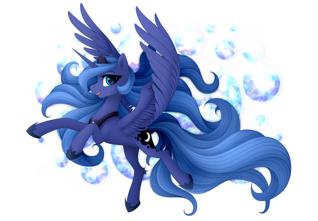
 >>/2707/
multiple Twilights.....they´d better not notice my secret chocolate milkshake....

> There is a reason why this one is my favorite. I messed around with it for several diffent cut N paste mixed media experiments and sometimes gave off a certain vib that I really liked.
yeah,it seems like Twilight has a wing(?) in her back right hoof.
it´s true that there are vibes while editing that appeal to the author and that´s where improvised ideas come from, even if no one else understands what it does at first sight.

What I can tell is hat you have modified the lines so they are not uniform or simplistic in their shape in all her body. It´s almost like her shadow plays with the  colorproportions


> These experiments actually do relate to my project but will result on something on there own regardless of the project's status.
I didn´t understand those lines. I think with their context I will get them or appreciate them better but I think you are revealing too much or is it a "mirror" test of what you are planning?

I don´t know if love is real or an illusion. Maybe the user behind the screen was a dog all along....

 >>/2708/
> This one looks a little sharper but the edit is very subtle.
> This one is superior to  >>/2693/, slightly at least.
Thanks, like  >>/2655/, I wanted to check again if the mobile version was the correct choice. this is why I make these comparisons even if the image feels repetitive.

> Still my fav, though  >>/2695/ has the most dramatic improvement.
that favorite pic....only cost me to define it a little bit more and intensify the shadows and contrast. That was if not the shortest, pretty close to edit it without thinking anything.

I edited  >>/2695/ because I didn´t feel that was completely right. I may becoming a maniac but there are some images that I edit slightly like this because I cannot enjoy them completely. My enjoyment gets reduced a bit because of that room of improvement that I project into it.

> My second fav, even if the body is a bit simple, I still like the darker, sharper color for some reason
yeah, it was one of my "why not" edits and apply those colors. It was edited just to do it in reverse from the latest Celestia editions with the cold effect. Luna/NMM has blue already so let´s put our hooves for giving a different vibe with another color. And that´s how it was created. It looked pretty good with that purple effect and I intensified the color to the maximum. Also, I complement it with contrast and adjusting the lightning/shadows to look like the light shows her as an intimidating pony.

> Really like how this one looks. Especially that sun.
I am surprised honestly. I just wanted to repeat the cold effect pattern but I ended up caring more about the lightning than caring about how the blue tones flood Celestia´s body. Instead, I put more focus on the lightning, shadows and contrast with the cold effect (more or less in the halfway point, I can´t remember the exact number). The PC part just added a bit more of definition and/or contrast.

So yeah, well.... a bunch of pictures that bring nice impressions with some of the simplest adjustments. But hey, I guess that works although I don´t like ending up as a conformist.