Actions
(2.45 MB, 1600x1500)
(491.77 KB, 1600x1500)
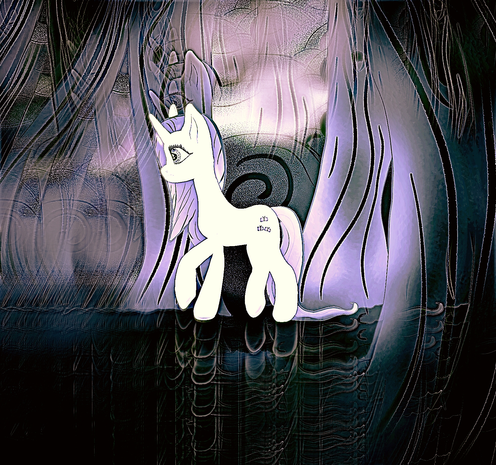
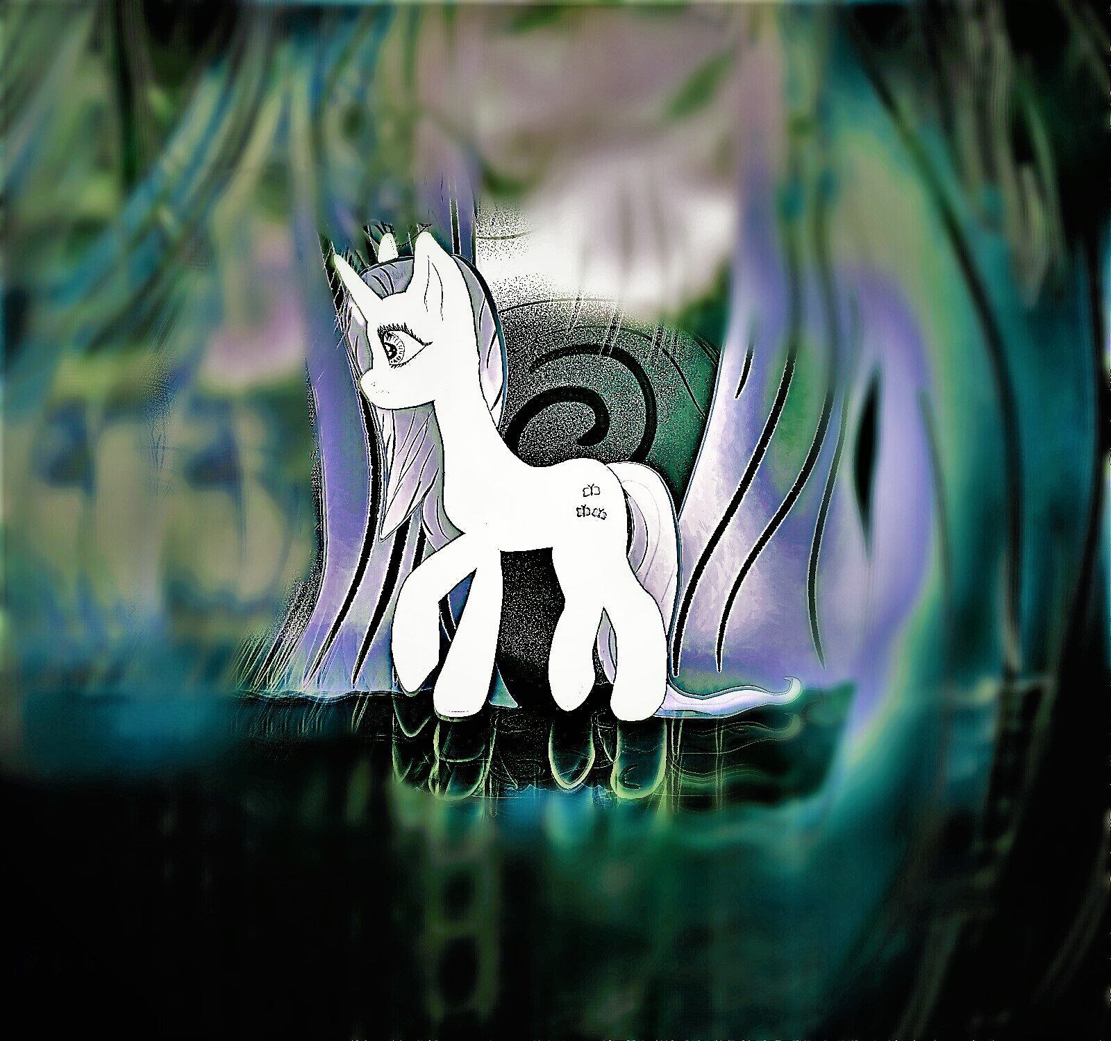
 >>/3322/
> This edit is my favorite. I like the fire within the ice. A cold heart with a burning rage on the inside. Feel like there could be good symbolism potential.
I don´t have anything planned about that but if it inspires anyone for that concept, feel free to do explore it.
Using that technique is like repeating myself but I suppose, I set a comfort zone by editing Celly like this. In fact, these edits  >>/3308/ and  >>/2655/ come because of the positive reply of this pic  >>/2417/ with the icy mane  >>/2408/.
I don´t know which pic I will use for opening the next thread but I am considering it as a contender.

> Though  >>/3309/ (you) is the best of the batch if I'm going to be entirely honest.
aesthetically it´s the most logical way to show her. It came while I was messing up with the adjustments on the PC editor so I decided to make a copy for it.


> Of these two,  >>/3310/ (you)  >>/3311/ (you) yeah, not much can be done with just corrective edits ( but with a philosophy of creative destruction maybe useful even...)
well, that pic has like 8 upvotes on Derpi, (I think?) and it had the artist needed tag on it.

I have been trying to apply that philosophy at first. I cannot control all that much the flawed effect and if it´s overused, it brings actual aberrations.
I tried for 20 minutes to adjust it with the colored edit and I simply cannot do anything. It ended up in a huge mess that didn´t make any sense. However, a couple of hours later, I tried your request again with monochrome edit as the base material and I fortunately found a solution.

Blurriness is what balances the mess so if you try to define the picture more, you get punished with more nonsensical lines. The first comes straight out of the mobile app and the 2nd has a circle of blurriness around Fluttershy. The unexpected part was that while I was editing with the PC, by intensifying the colors, it brought some variety in that circle, so there is a huge contrast between the black and white focused part and the unfocused zone.

So, yeah, challenge accepted even though using the flaws strategically is kind of random.

> Do you think feel a bit of nostalgia for the thread or a bit stuck and wanna break?
nah, I ask mostly that with a mindset of: do you enjoy or find this entertaining? Editing anything is easy at this point.

> If you're still posting edits and just wanting to gauge others opinions, we can just let it take it's course.
That´s what interests me more in fact. Mostly because I want to figure out which way should go next.

> Though I still have some material to post, it's just mostly scraps, so I'd be focused either way on the near term with /go/ and something else going on in the background. It won't bother me either way.
alright. I can keep the thread for those scraps because not all the edited pictures are valid to show them off in a thread to expose them (mostly because that thread is more focused on exposing rather than testing).

I don´t know. I guess these questions happen because I feel I will have to organize a bit the material created.

> Don't think I've forgoten about our compression fight!
that Skystar reminds of those RPG vectors. The compression certainly makes you travel back in time.