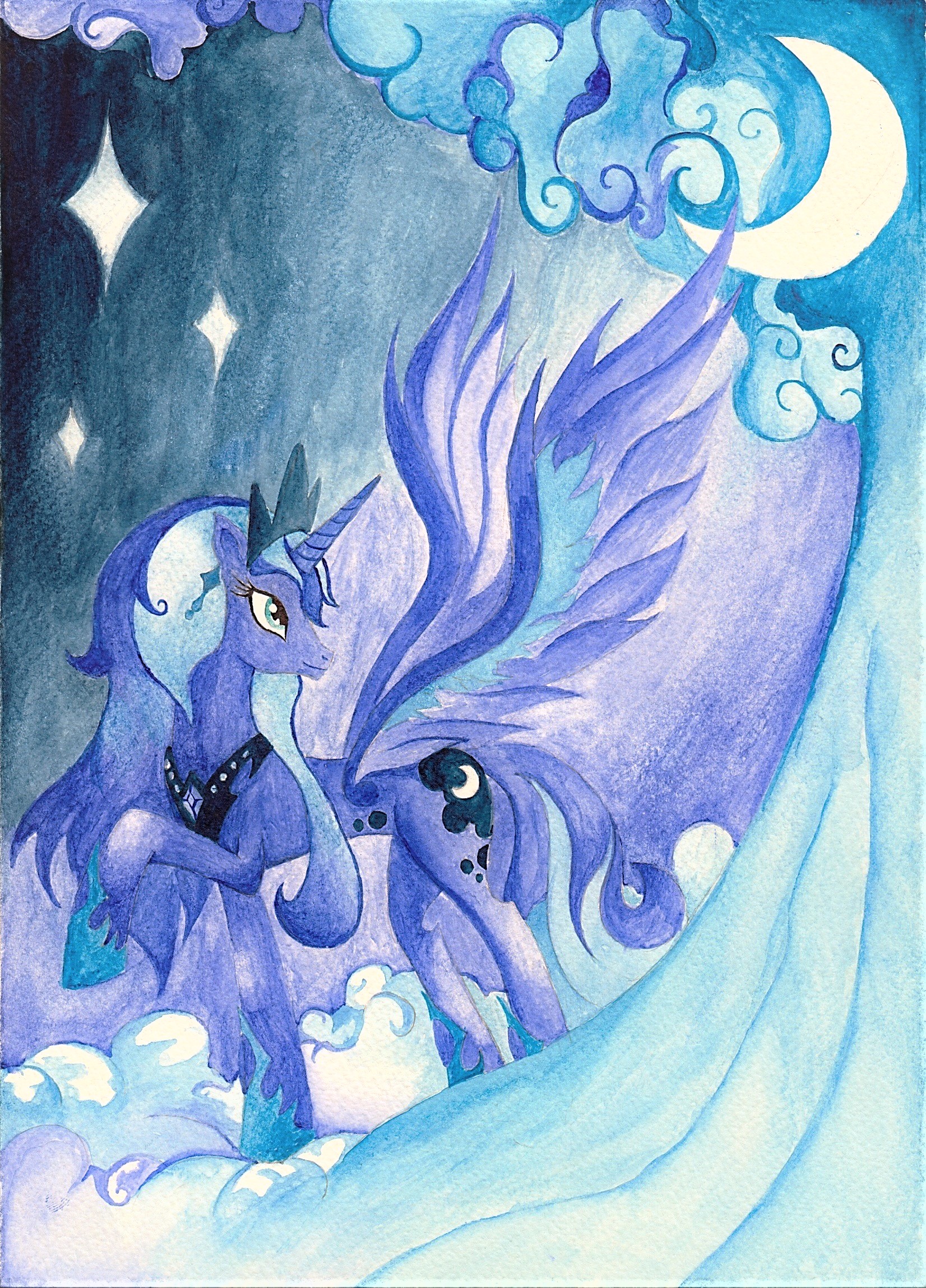
16667__safe_... jpg
(1.56 MB, 1652x2298)
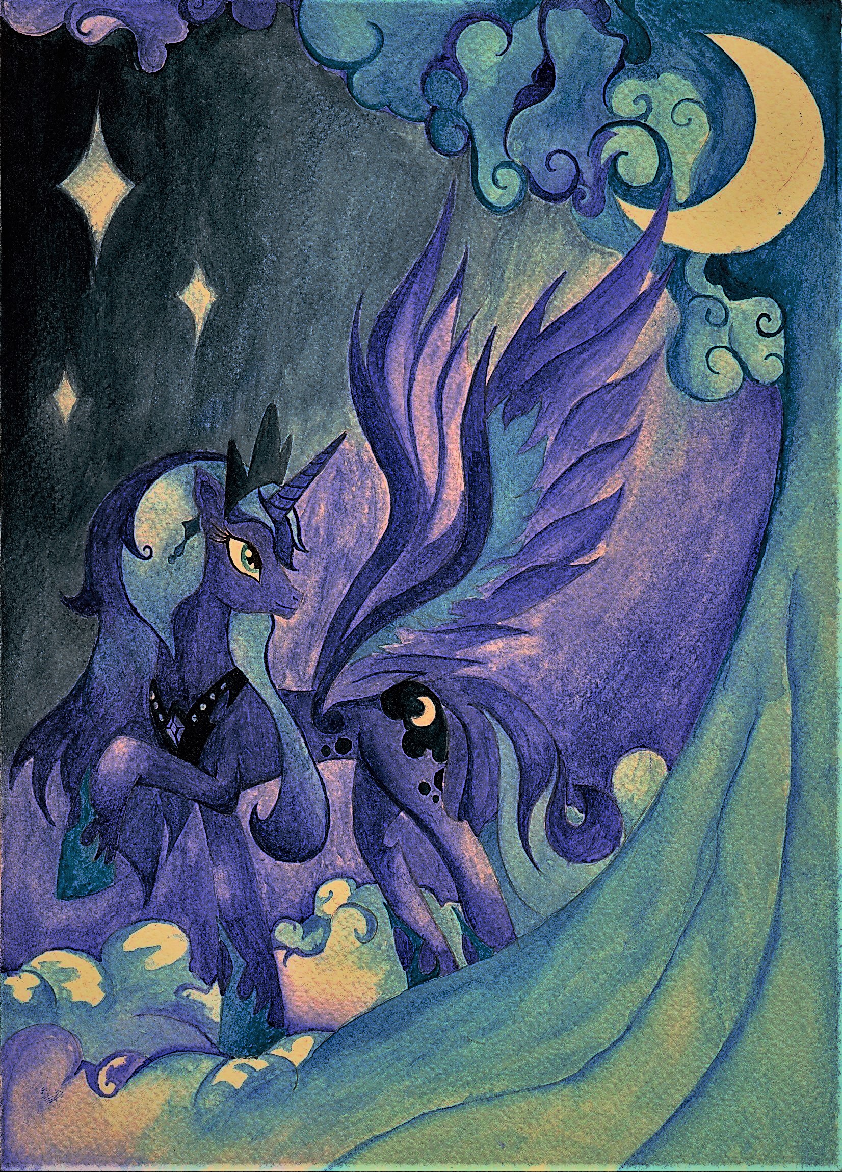
16667 1st... jpg
(1.52 MB, 1652x2298)
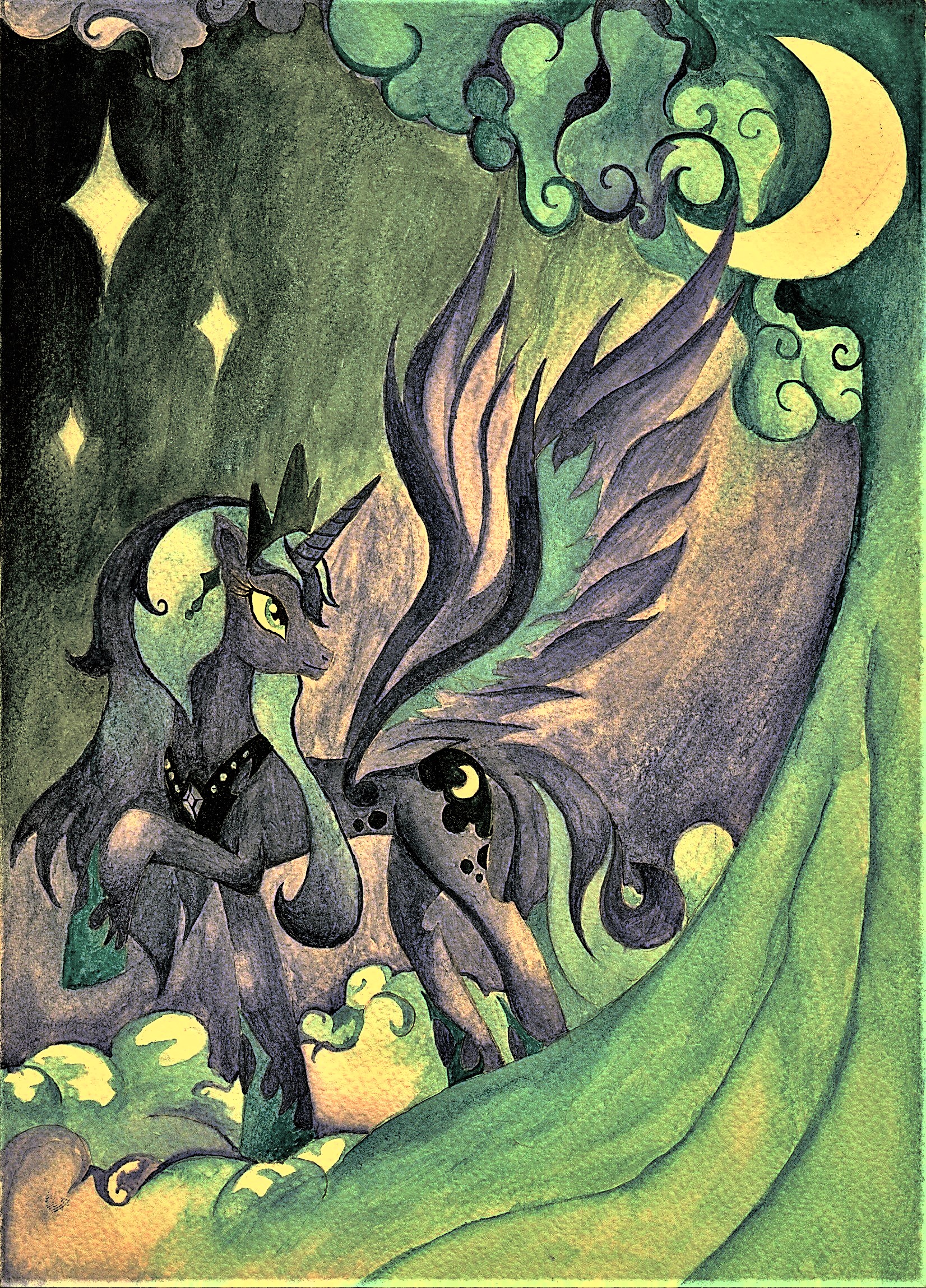
16667 2nd... jpg
(1.79 MB, 1652x2298)
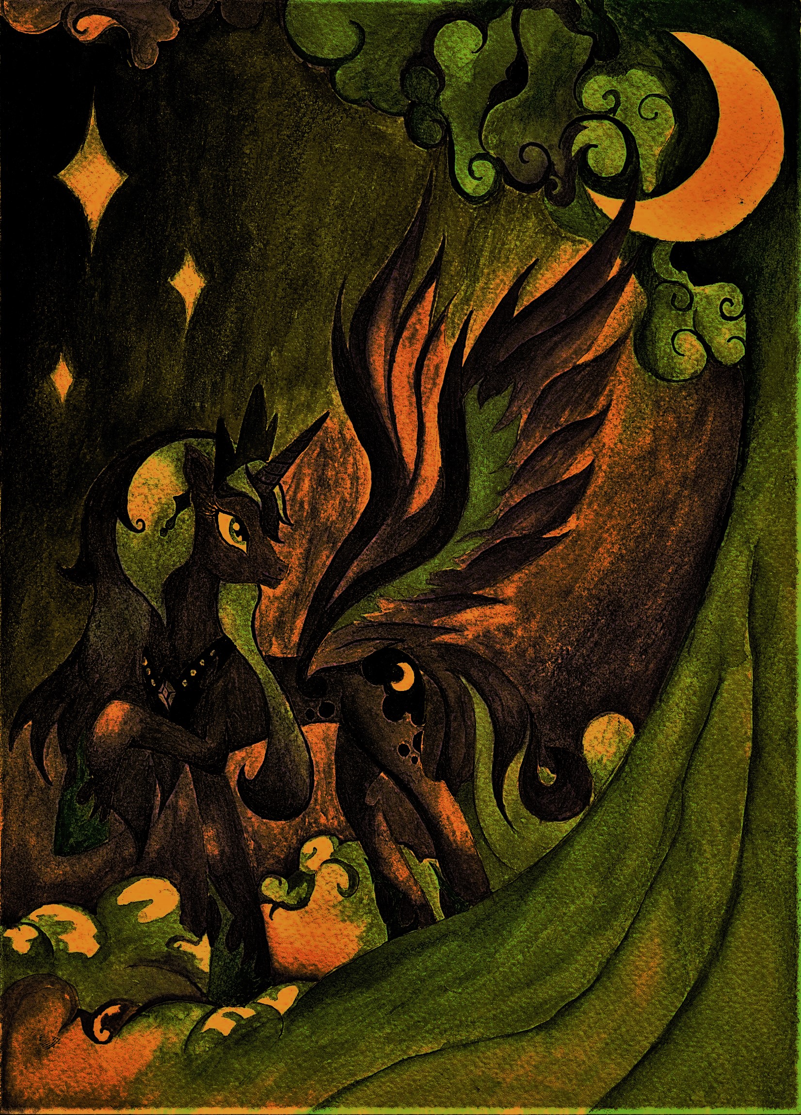
16667 3rd... jpg
(1.98 MB, 1652x2298)
16667 4th... jpg
(1.62 MB, 1652x2298)
 >>/4157/
> Just trying to get your barings by feel and seeing where it goes.
do you want the whole process visually? I have all the pics for the process...well, I am uploading them all in order so you (and I) can figure out how "that magic" (if touching buttons is magic) happened.

> I still need to try to find some pics from the style I thought you were aiming for though.
finding autumn themed pictures should be easy to find (over 1k pictures on Derpi) but as for lo-fi/flawed pictures.....good luck at discovering any. Nobody wants to see a low quality image. Even if you found their tag, barely anything in its category would reach over 100 upvotes.

> I ought to try to do more like this where I select just parts of the image.
going into a partial route could be a more playful method to try a few effects instead of the whole picture.

> The only part I do not like is the darkened wing, I should have made it a different color or the same color of the rest of the image.
yeah, it looks a little bit out of place even though I thought you had added that color just to make it clear her bat aspect or something related to your vision about her.

> It's the cubism filter. She certainly looks pretty retro in the thumbnail
yeah, I had seen that filter before with this image  >>/3780/. It shows how situational some filters are depending on the image entirely. No filter is going to work in the same way all the time. Instead of looking like cubes, they feel more like a 32 pixel art by downgrading the definition.

 >>/4158/
> I'm trying to repeat the process, I know I changed the contrast and messed with some contrast and color filters but it seems like there was something else.
it definitely looks like the colors are sharper than the original picture and definitely doesn´t look like the invert filter could be applied here. As soon as you modify lots of aspects even if it´s a slice of that adjustment, you cannot remember the settings unless you record yourself for the whole process

> the only problem is when I'm in a bit of a zone and don't want to think about it if ya get what I mean.
I don´t think that much about my images either even though in retrospective, I do care when they go further than expected and I have to put some logic into them.

> Nice color addentions with that seapony Luna. I also like the lighting as well.
yeah thanks. Even though I can enjoy the original image perfectly, for the sake of editing slightly the lightning and removing the darkness by giving it a more vibrant look, I decided to make a "what if" into it and get both options for those who feel that it´s looks darker than it should have.

However, I didn´t have problems with that image, it´s pretty well received...

unlike the next picture which I am going to post next...