>>/4232/
> My first solution consisted in applying the monotonic image, (one single colour) so the rest doesn´t look so messy. I made this edit back in November.
This first edit looks like another Ice Celestia theme. I like it pretty well.
>>/4233/
>>/4234/
so the final correction base is the one in you used as the fallback for your others?
> so having removed that psychedelic effect and getting a cleaner result, it has always looked as something incomplete to me. Why? Well, the picture has technical glitches and this leads me to believe that this was a bootleg image for the artist, hence the artist needed tag.
Makes it feel like buried treasure amongst the trash, and you are trying to bring it to its potential.
> As the image was pretty messy by itself, I have taken the freedom to experiment with a couple of edits out of the final material, particularly the addition of heat into the picture and...
> The fanbase liked to ponify everything back in the golden era so I decided to mimic a bit this album cover which might be pretty familiar.
This ponification of th album is my favorite. It has a nice atmosphere to it. I can understand the fear of cringe, as both ponification and the dark and gothic could get you shouted with dead meme well, partly dead meme and deviart tier taste but I like the atmosphere of it and I've had way crazier ponify for the shake of ponifing urges than that...
Second place is your first edit from way back in November,
A 3rd is the flame edit. Then your correction base and final the pre flame one which just feels like its in a lackluster state of incompleteness.
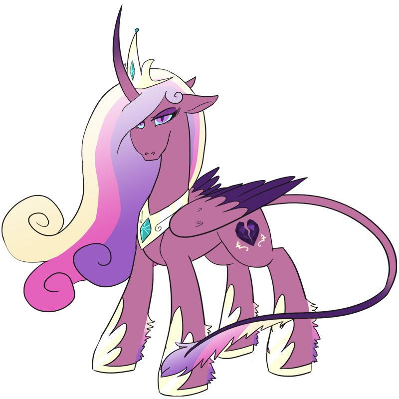
This was just some messing around trying to correct my least favorite part of the image, her snout and mouth. With mixed though not horrible results. It just feels like most of it needs to be better realized/need to spend more time actually learning how to draw with my tablet.