logotop png
(46.63 KB, 311x185)
download jpg
(3.75 KB, 225x224)
download2 png
(6.07 KB, 362x139)
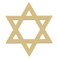
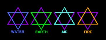
This is an interesting logo. Upon inspection you will quickly see that it is, in fact, a Star of David.
Not because of any Jewish connection (or is there?), but probably because it is intended to represent the union of the four elements.
If they simply overlaid the elements, thought, their logo would look very Jewish indeed and some people don't like that.
Instead, what they did was create an unbalanced version of the Star of David where the water element is predominant. Quite interesting considering how the "love and light" religion is unbalanced towards the feminine principle and tends to indulge in spiritual bypassing.